What's next?
Task manager mobile app to help focus on the next, most important task
Roles: Concept, Research, UX, UI Context: Student project

01
The problem
How do you decide what task to do next?
In our busy lives, we often have multiple tasks and responsibilities that need our attention, and it is a challenge of effectively manage all of them together.
Traditional methods of task management may not provide sufficient functionality or flexibility to handle the complexity of task prioritization.
The solution
A task manager app that help organize your daily tasks based on their urgency and priority. According to the settings given to each task, the app automatically prioritizes what is most important, and arranges all in a single, easy to manage list.
02
Research and insights
Research methods used in this project included conducting a survey to gather about 30 responses, aimed to understand users' habits, preferences, and challenges when it comes to utilizing task manager apps and methods.
A few findings highlighting specific user needs and preferences stood out and guided the design of this app:
46.6%
Said the feature they use the most on task management apps is lists.
The app should have a list-based structure.
53.3%
Said the hardest thing to manage is all tasks combined.
The app should include a feature that allows users to view all types of tasks together.
66.6%
Said they often open a new list for each new task as it is easier, despite the potential mess.
The app should provide easily changeable lists that can be updated in real-time.
The research helped to create and understand the main user personas:

“I wish I could see the big picture of how my studies can work with rest of my tasks“
Meet Ella, a 26-year-old law student at Tel Aviv University. In addition to her studies, she works as a waitress, volunteers for extra points, and shares an apartment with two roommates. She faces the challenge of balancing her academic workload with day-to-day tasks.
Pain Points:
-
Her schedule feels like one big mess
-
She’s afraid of missing school deadlines
-
She use’s too many apps and techniques to keep track
Goals:
-
To spend less time planning her schedule
-
To know how long each task takes
-
To feel like she’s on top of things
As a result from the research, a few conclusions came up regarding important features in the app.


What’s next?
To simplify the user experience and reduce the overwhelming feeling of task overload, the home screen will display only the most important task at a time.


Automatic list
The app will generate a to-do list based on task urgency, incorporating tasks from various lists. When creating a new task, the user will define basic parameters, which the app will utilize to automatically arrange the list.
The user will have the flexibility to modify the task order as needed.


Customizable Sub-Categories
The user will have the freedom to divide the list into as many sub-categories as they wish. This capability will provide a sense of progress and accomplishment across various areas of focus.


Templates
Predefined templates for various task types will offer a clear visual layout, making it easier for users to understand their required tasks and save time when adding them to the app.
Main user flow
The main user flow works around adding a new task to one of the lists.

Wireframe

Before

After
The generated task list on the home screen has been changed so it will be easier for the user to identify what tasks are coming up.

Before

After
The task prioritizing options have been changed both in the copy and in the button type.
Additionally, the "Back" and "Done" buttons have been pushed apart and separated by color to avoid mix-ups.

Before

After
Task types have been changed from totally customizable fields to pre-designed templates to simplify and shorten the user flow.
04
Design
The ideas behind the design were to keep the app simple and familiar to the user, to make list making fun using bright colors and and animations, and making the user feel good about him/herself by using encouraging language.
The system made for tasks visualizations has 3 variants:
Size = Length (Less than an hour / 1-2 hours / Longer than 2 hours)
Color = List name (Homework / Chores / Other...)
Shape = Task type (Note / checklist / Meeting)

Task check

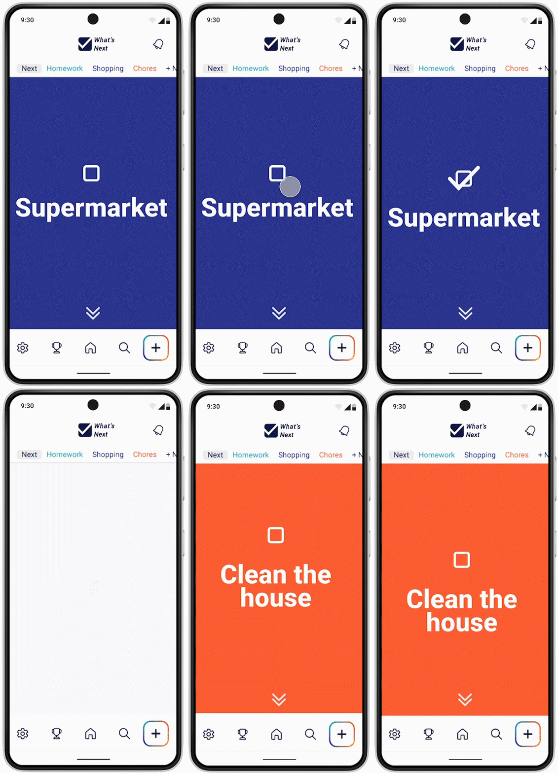
The home screen shows only the next most important task.
After the user has completed the task, checked it off, and celebrated, the next task appears.

Checking off tasks is the best feeling ever!
Seeing only one task at a time helps me focus on that task without feeling overwhelmed.
Home screen

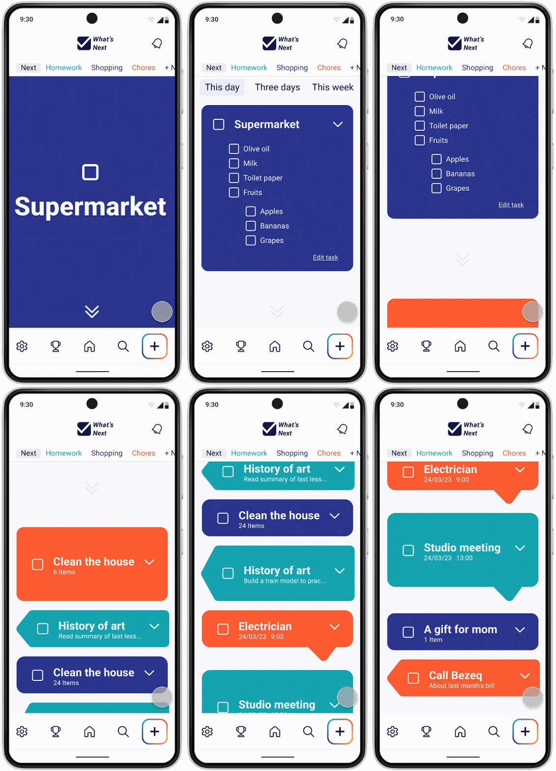
Scrolling down from one task reveals the comprehensive task list, dividing the home screen into three parts.
Users can choose between viewing tasks by date or organizing them into separate lists, and navigate around the main features of the app.


Breaking down the task into manageable baby steps helps me transition from focusing on small details to seeing the big picture.
Adding a new task

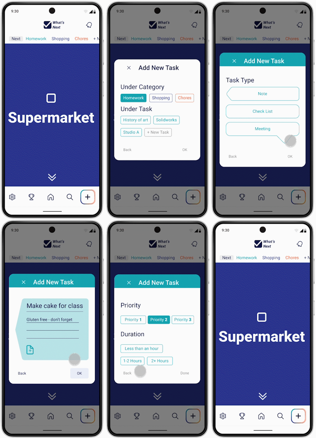
The main flow of the app involves adding a new task, with options to create new subcategories while keeping the choices to a minimum.
Each task is themed according to the main list it belongs to, as a reminder to the user.
The final stage includes parameters that help generate the automated list.


Templates
By using the shape templates, the user can easily identify what type of task comes next. Along with color-coded categories, the lists are kept visually organized and easily readable.
Meetings

Notes

Check lists


Now I can add tasks more quickly and categorize them appropriately by task type, making it easy to identify different task types on my lists.
Statistics

Statistics of task completions are important, as they make the user feel accomplished and motivated to keep going.
The first part shows the number of tasks completed in the chosen period of time, and the second part displays the progress in each category.
05
Notes and thoughts
a. Throughout the project, refining the flow to make complex tasks feel effortless proved to be a big challenge, as there was a large number of parameters to take into account. The goal was to gain the right balance between functionality and simplicity, ensuring users could easily grasp the app's features.
b. Task prioritization was a crucial aspect of the project. As the user research revealed, prioritizing is a significant challenge for users. Even though the automatic task organizer is conceptual, it was essential to carefully select the variables presented to the user. In the future, the plan is to introduce more options to cater to diverse user needs.
c. Using color coding for task categories enhanced the visual experience but brought up some accessibility challenges. Though all the colors were changed to ensure accessibility, moving forward I aim to provide alternative identification methods.
d. Handling task dependencies was a complex issue that came up while working on the project. While I managed simple dependencies effectively, there is room for improvement, especially as categories get longer and more complicated. In the future, I hope to resolve these types of problems by building a more sophisticated system that allows the user to manage intricate task relationships seamlessly.
